
Something happens to the tile pattern when it’s pressed into the gelatin, and everything sort of smooshes in a way that I don’t care for. It workes better if I press it directly against the paper. The same cannot be said for these stencils…
The secret to working with the Akua inks lies in also using the blending medium and the transparent base so that you can control the viscosity. Thank you again Catherine Kernan!
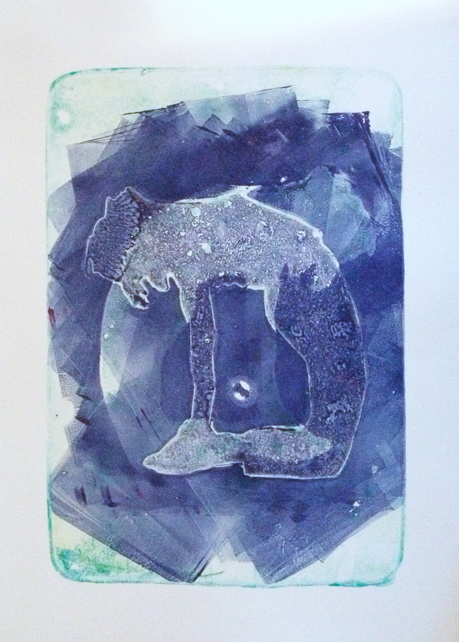
This one was a bit of a surprise, I thought the ghost figure would be more prominent but I like it this way.
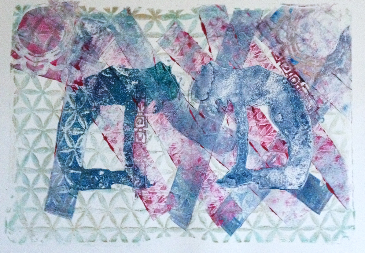
Here I used the rollers to lift off patterned ink from various surfaces and layer them down on the plate. Sort of a hodge podge but there’s potential here, a direction for future working sessions.
Meanwhile, last week I went to MFA Boston. My brilliant (if you don’t mind me saying so) strategy there was to sign my daughter up for a sculpture class at MassArt, leaving me a few hours of free time to linger at the MFA. I live more than an hour from the MFA and usually it’s a race through to see everything I want before heading back home. Never enough time to linger. Now I will have hours to dally and it is heaven. First I visited a favorite Neil Welliver painting they have in its own nook, the Sargent Rotunda Niche: http://www.mfa.org/collections/object/goulds-hill-34175
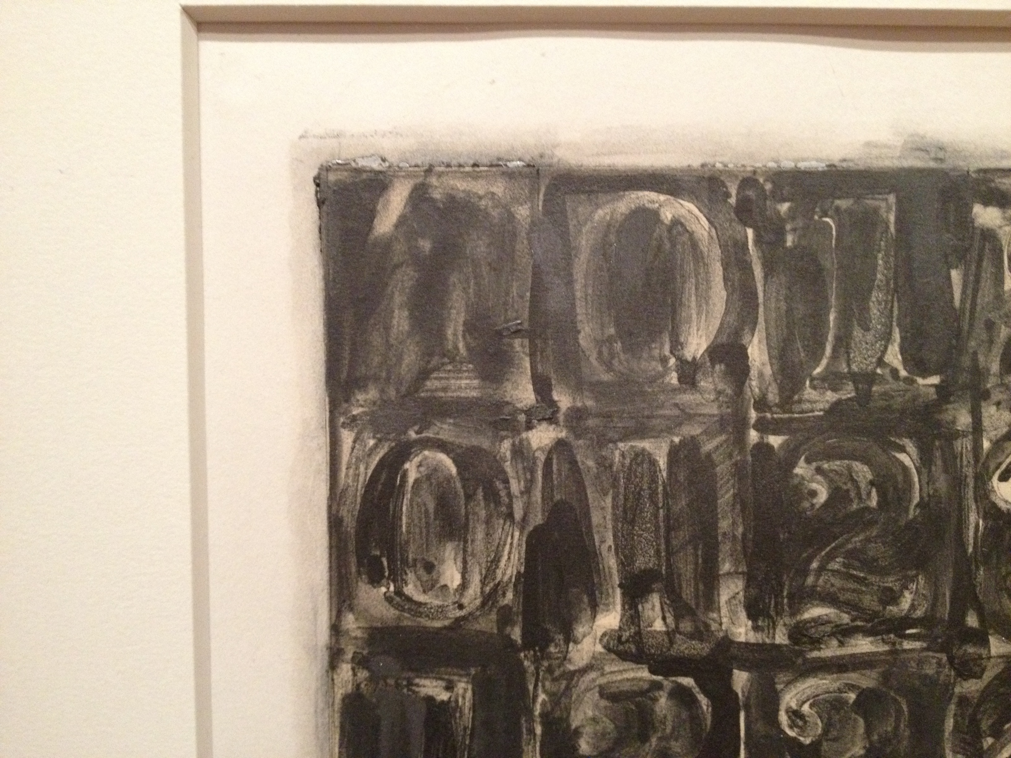
Then off to the Art of the Americas wing to see the Jasper Johns print exhibit. Here’s a picture. Mind you I’m not sure if I’m supposed to post pictures from the MFA here, but this is in the hopes of enticing more people to go.

Jasper Johns lithograph, 0-9.

Jasper Johns, Untitled. First etchings, second state. 1967-1969.
And this is a similar print, but it’s Jasper Johns meets Art Nouveau. Completely unexpected. This small print show revealed that John’s influence runs deep in my work.
Here he’s working with liquid graphite. It’s often little details like the gooey edge where the cream paper is mounted to the white backing paper that get me excited. These things often don’t show up in reproduction, and are one of the reasons why it’s important to see original work whenever possible. I’m forever peering at the sides of the canvas to see if the artist painted those as well.
Which brings us to Shinique Smith, who painted the sides of a trio of canvases in bright primary colors that sizzled on the walls of the Henry & Lois Foster Gallery. I didn’t like everything Shinique did, but she’s young yet and I liked enough to warrant further attention. Bold and brash is great, but sometimes I want more depth. I think she has that depth, but it could be developed further.
