Uncategorized

Museum Visits and Studio Notes

February 2015 was the longest month ever, enough said.  But it’s March now, and as the days lengthen, and my daughter’s art class starts up again, I find myself in Boston with more frequency.

IMG_6007

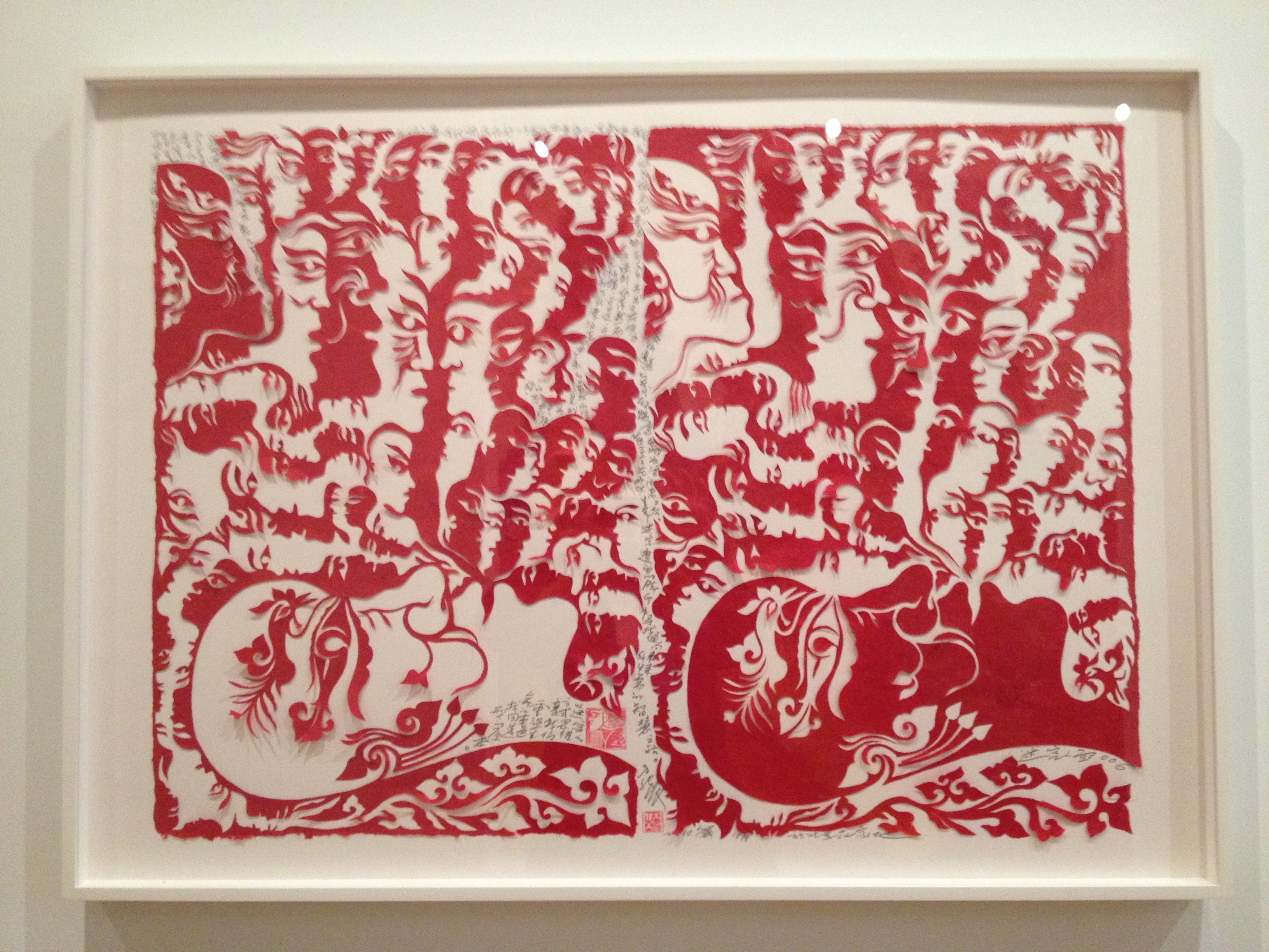
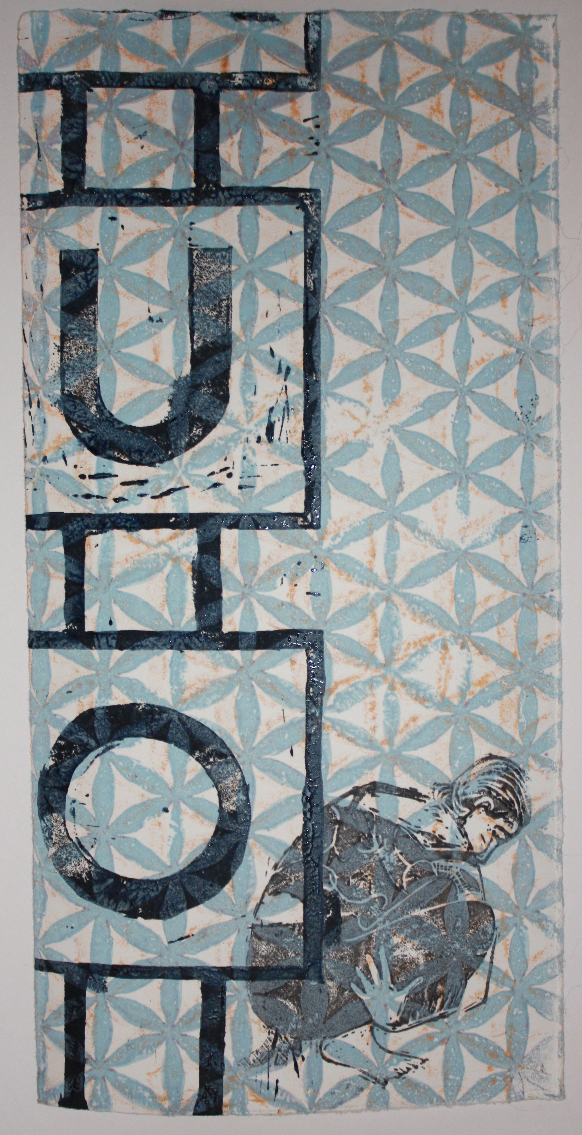
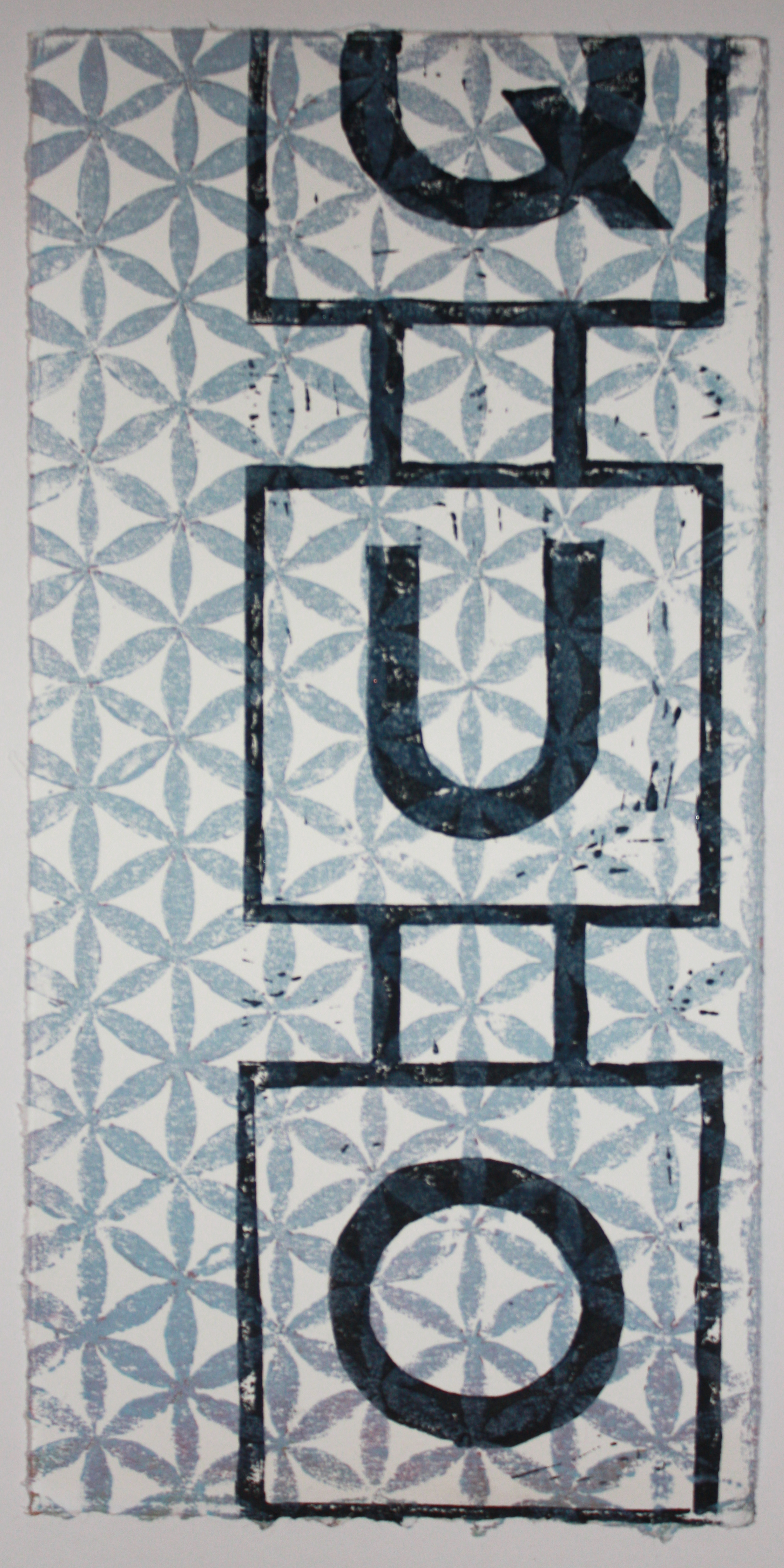
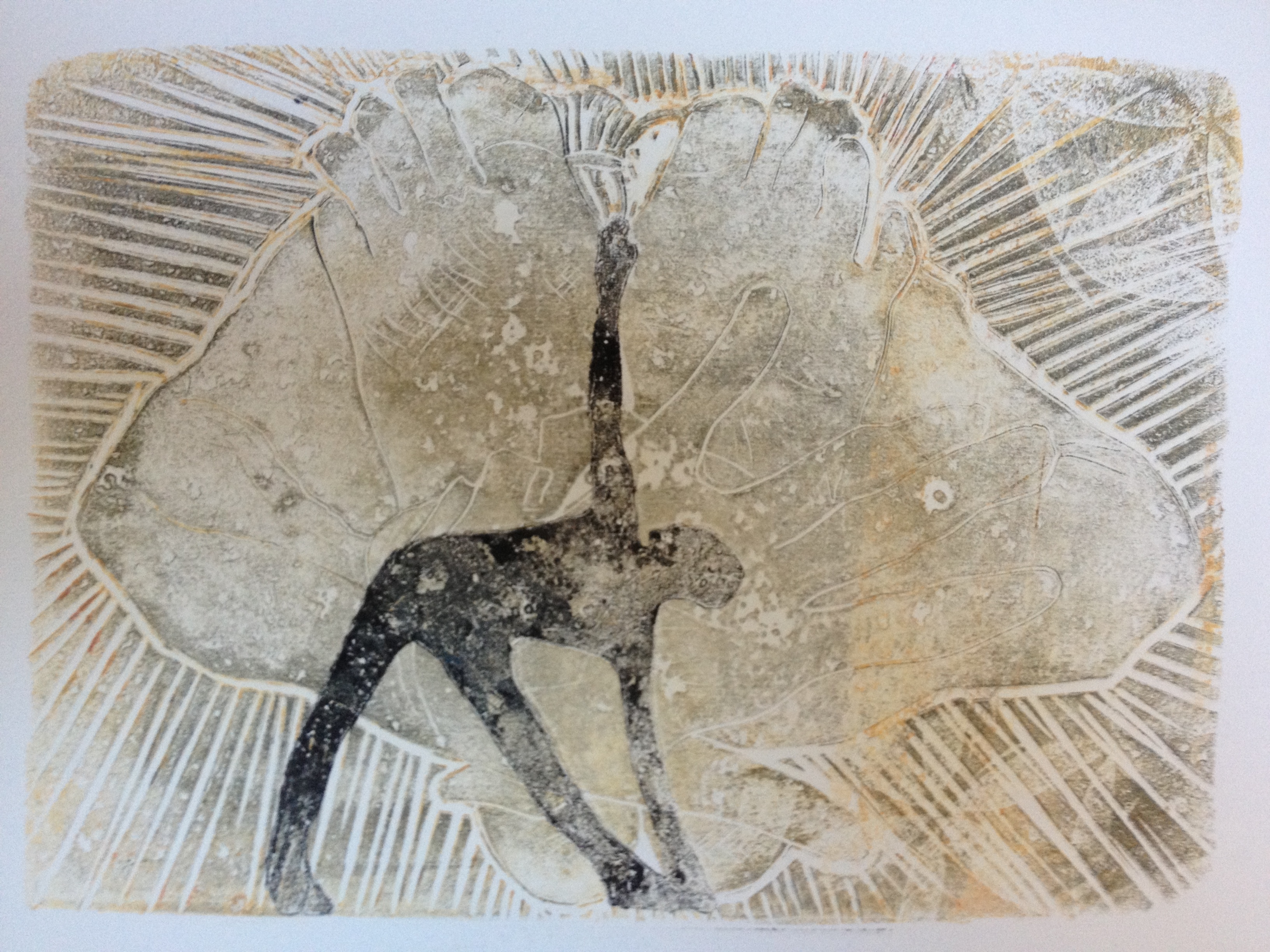
A taut exhibit in a corrider at MFA Boston has me exploring contemporary Chinese Art.  This show is from the collection of Carolyn Shu and Rene Balcer.  The above piece is one of the Face Mazes of Lu Shengzhong.  This is just a teaser, I’ll have to get back next week to document it better as the MFA does not seem to be hyping this show so much.  I’ve learned to forgive the MFA its excesses because it comes out with gems like this, and I figure it has to pay the bills some how.

IMG_6022

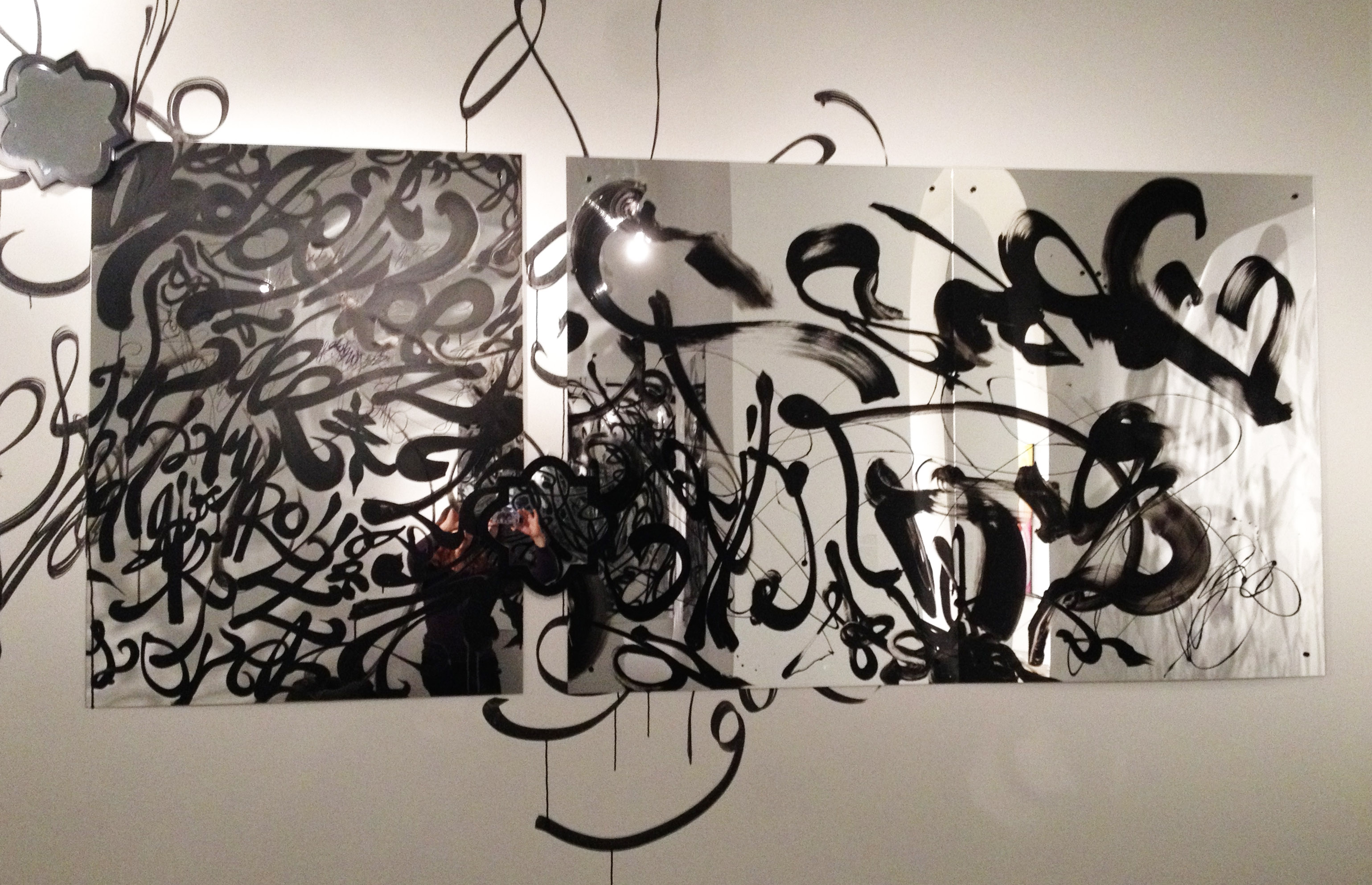
This is a reflection of myself in a piece by Teresita Fernandez, a MacArthur Grantee whose exhibit at MassMoCA (which might still be up) was just… it induced perspectival epiphany, among other things.  There’s a talk by her somewhere that was also quite good.  Forgive me but I didn’t make a note of the title of the piece.  It’s over where the side entrance used to be, if that helps.  On the first floor, contemporary side.

IMG_5994

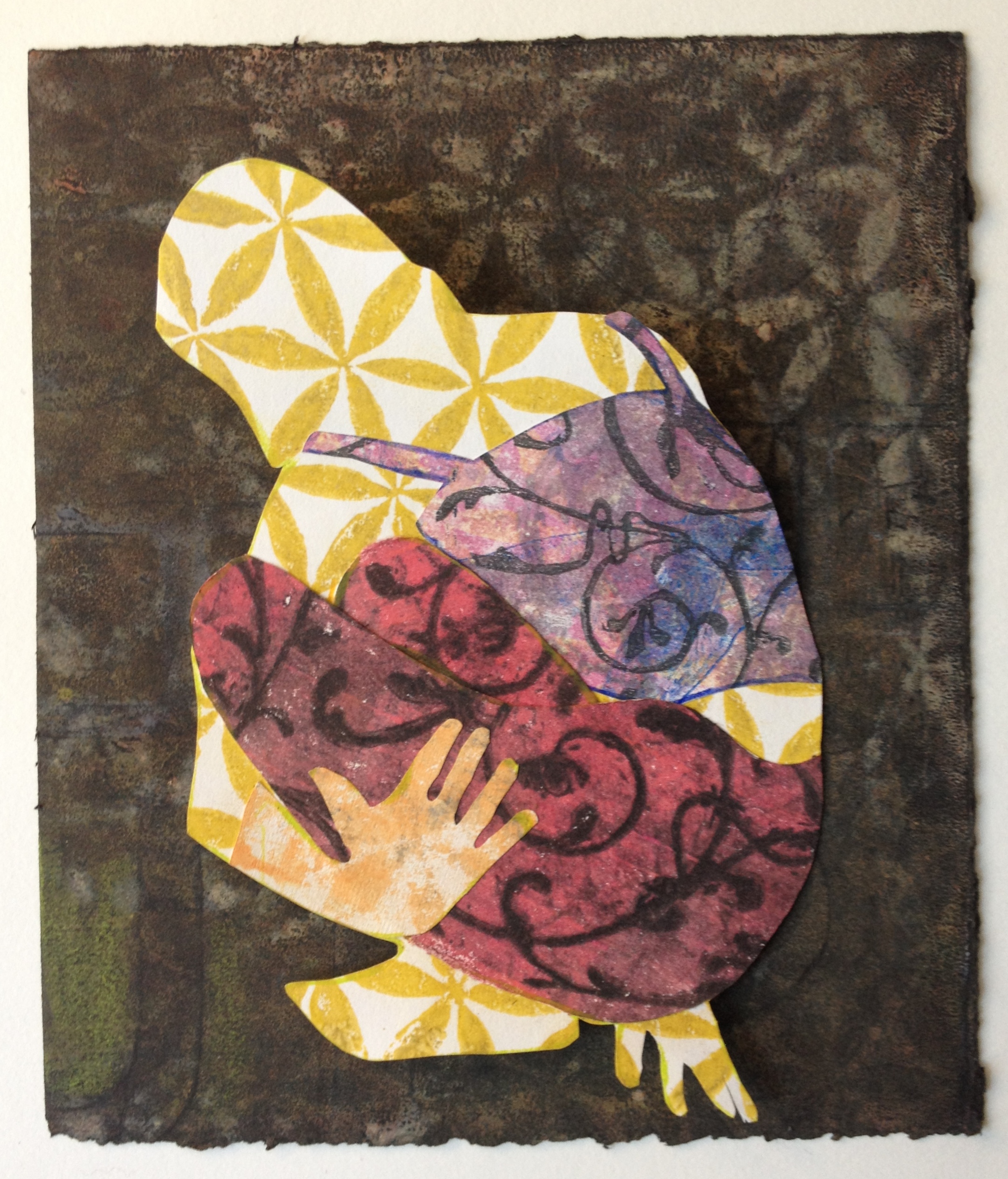
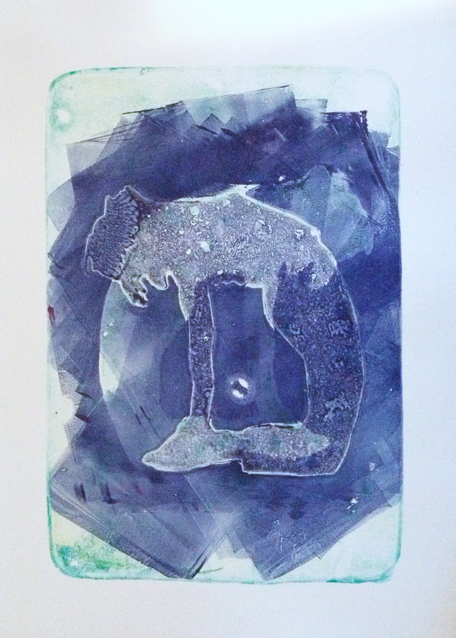
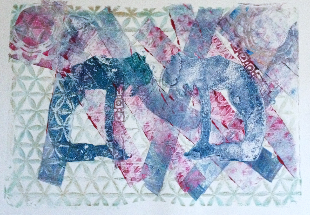
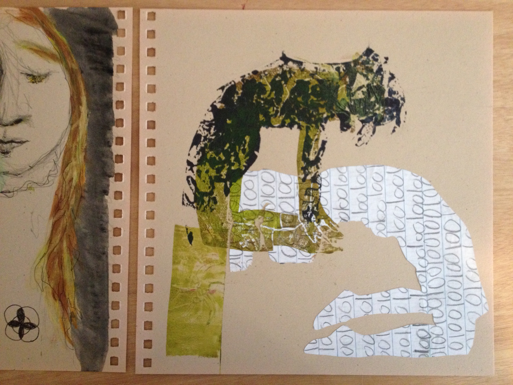
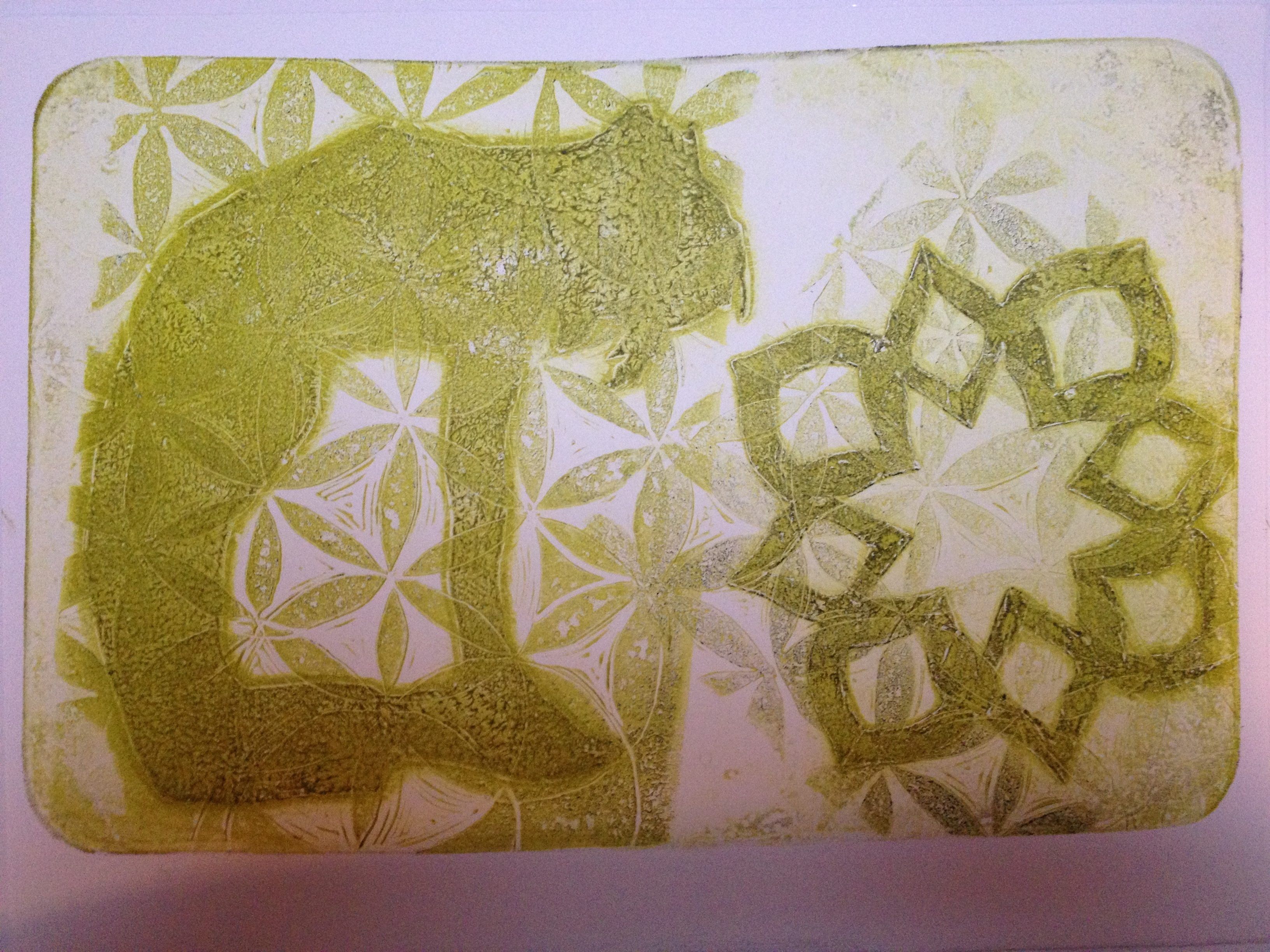
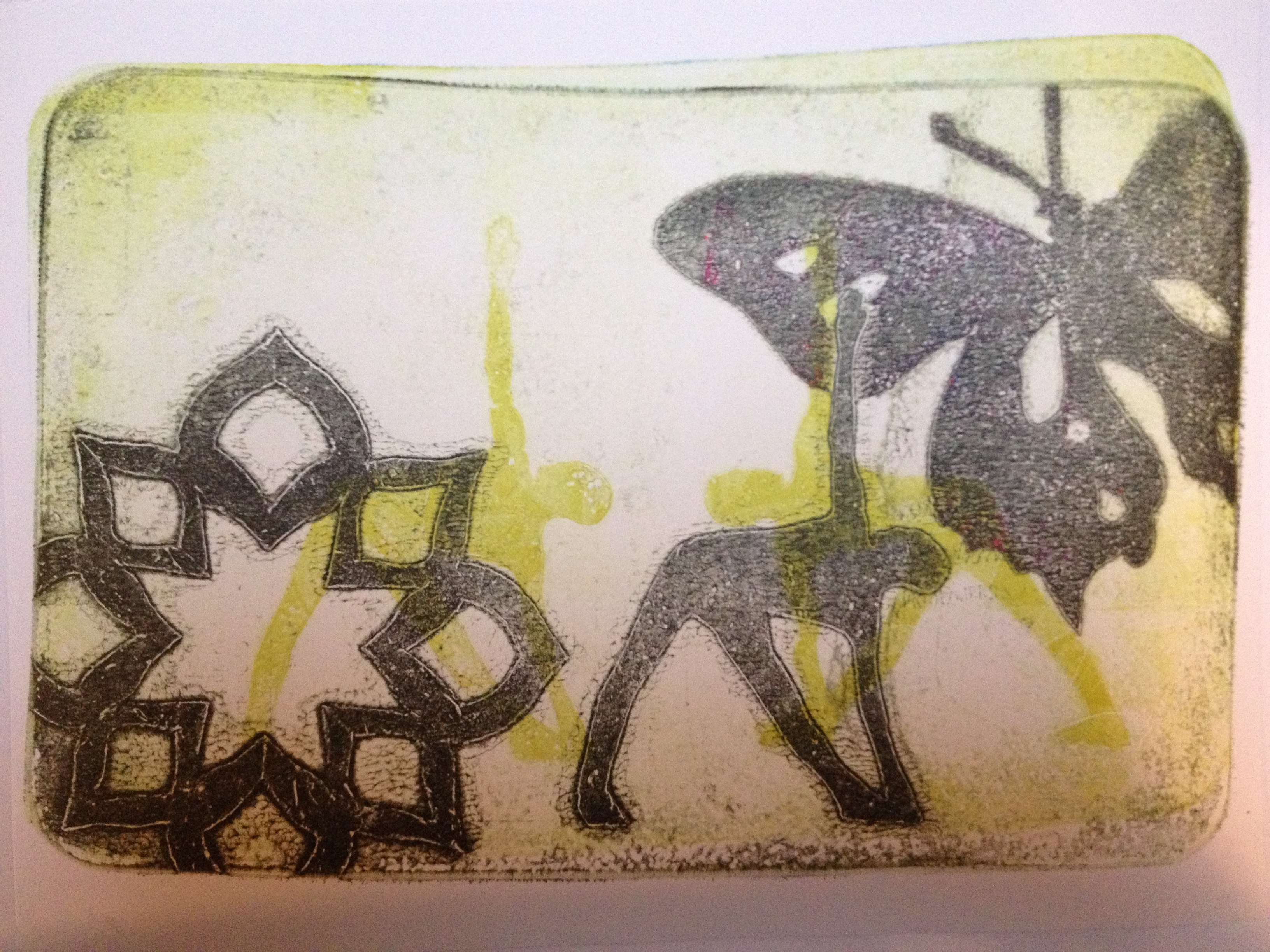
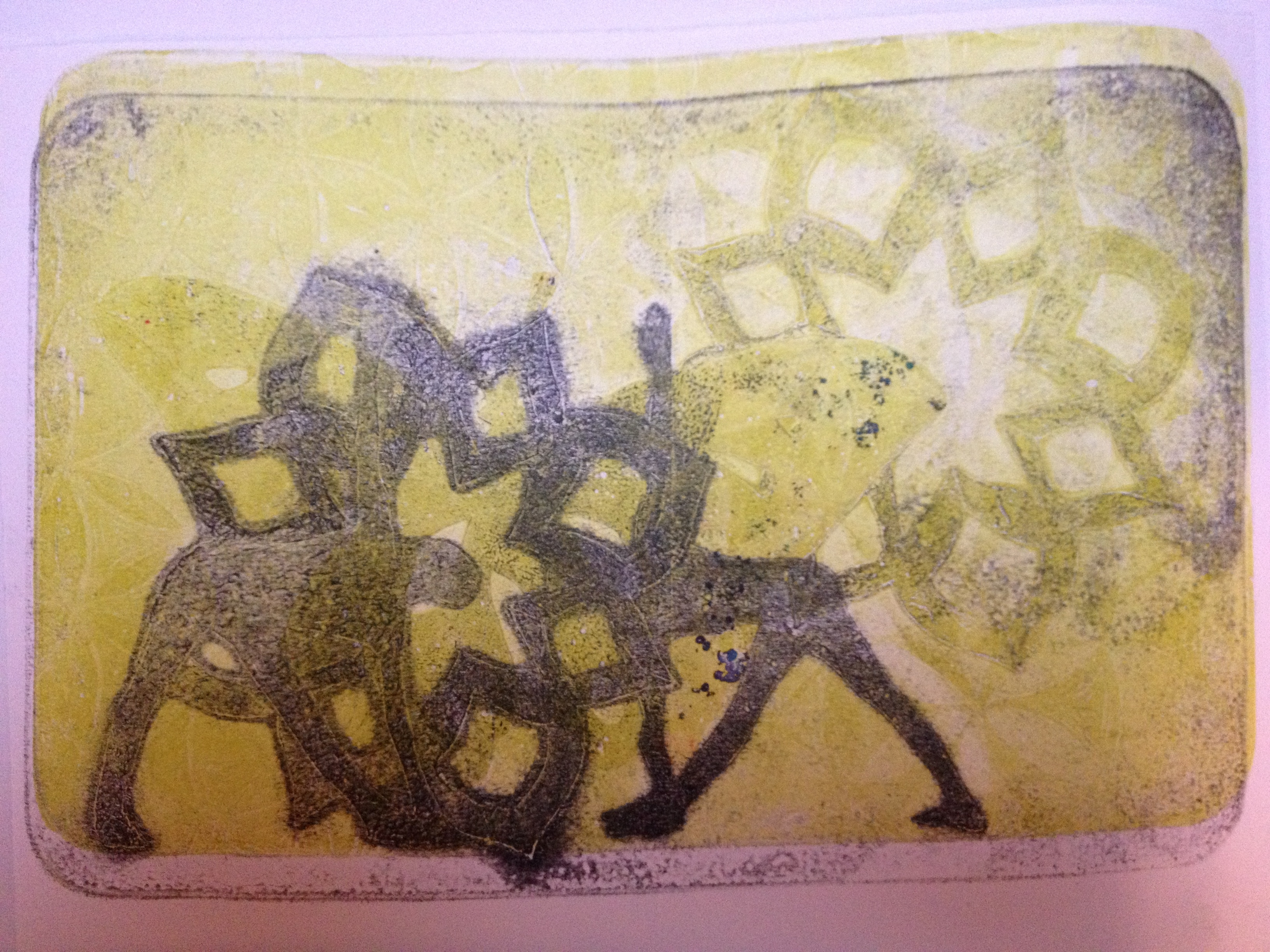
Hommage á Monsieur Matisse, collage and monotype

This small collage was made after a trip to the MoMA to see the Matisse Cutouts, which were glorious.  It’s not yet glued here which is interesting to me because Matisse himself didn’t glue down his cutouts.

Uncategorized

Quo

A good day in the studio yesterday.  Sometimes it feels like you spend all day to get one interesting thing at the very end.  It took the whole day to get there.  Not that I’ll throw out the others, but suddenly it all crystallized.  That, that indefinable thing that I didn’t know I was looking for until I saw it.

Reach

quo  qu2

One place where I have not done well as an artist is dealing with rejection.  I sort of suck at that.  Today I received a rejection to a show I was hoping to get into.  What I normally do with rejection is is to stop trying for a while.  This is not a productive or useful response.  Today what I will do is read a chapter from The War of Art, and then decide what to apply to next.

The important thing isn’t that I please others.  The important thing here is that I am absolutely true to my inner vision.

I reject that rejection.

akua, journal, tile pattern

Sketchbook Thoughts

Lately my sketchbook has been a place to catch spare ink, notes from podcasts, and stray thoughts I don’t have time to tend to just yet.  The page below is bit of a breakthrough in my thinking.  The letters are from a liquor store sign in a nearby town, carved onto a plate and stamped here.

3_Santoro

Below is the same idea with the LIQUOR sign, but I didn’t like the scale and the obviousness of the whole thing, it seemed too too.  N’est-ce pas?

Colored pencil, pen and ink, birch bark, duct tape, akua ink.

2_Santoro

And here is the Islamic pattern, although I goofed it up with too many circles.  Gouache paint, colored pencil, stray ink from a plate my oldest daughter carved.

I need to call it something else, do more research into these patterns and who made them.

1_Santoro

I took the journal apart to photograph, intending to put it back together.  It’s one of those wire bound journals that the pages are forever falling out of.  Which turned out, in the end, to be rather useful.  However, middle child decided the wire was intriguing and gave it an entirely new shape.  It might be time for a new studio journal.

Uncategorized

MFA Boston

These trips to the Boston MFA are beginning to blur. I can’t say how amazing it is to go back, to look again, to look from a different angle or even from a different state of mind.

Here’s a fragment of a fragment, Jasper John’s Fragment of a Letter, in which he presumably added his own handprint.

IMG_5505

Below are 2 shots from a Shinique Smith installation, a small room entirely missed on my first visit in which I was chased away by an obnoxious woman who began asking me questions while I was trying to look.  Forgive me but I didn’t write down the title, but I did write down my thoughts:

“It’s like painting with smoke, bright primary colored edges keeping it from flattening into the wall.”

Okay- that actually refers to a triptych called ‘the step and the walk’ and not the installation, but still…

Shiniquemirrors

This installation incorporated sound and smell also, although I didn’t smell anything.  The light bounced off the mirrors and hit the wall in beautiful shapes, seen here:

Shiniqueshadows

Of course it’s interactive in that you can see your reflection in the mirror.  It felt a bit like being in an inner city subterranean environment without so much the frisson of danger.  It’s also calligraphic, the implication of Arabic script, the gorgeous interplay of light, sound, reflection, and sinuous line.  I spent some time in that little room.

Finally, here’s what Jen Mergel (Beal Senior Curator of Contemporary Art at MFA Boston) wrote about Shinique (referencing Cy Twombly and the famous “zips” of Barnett Newman):

“Fully aware of this American art history, Smith lets her liquid line flow as calligraphy with its own freestyle and emotional force.”

I just can’t seem to get enough… back to the studio.

Uncategorized

Playing with the Camel

twins

Something happens to the tile pattern when it’s pressed into the gelatin, and everything sort of smooshes in a way that I don’t care for.  It workes better if I press it directly against the paper.  The same cannot be said for these stencils…

The secret to working with the Akua inks lies in also using the blending medium and the transparent base so that you can control the viscosity. Thank you again Catherine Kernan!

mirroredustrasana

This one was a bit of a surprise, I thought the ghost figure would be more prominent but I like it this way.

twinustrasana

Here I used the rollers to lift off patterned ink from various surfaces and layer them down on the plate.  Sort of a hodge podge but there’s potential here, a direction for future working sessions.

Meanwhile, last week I went to MFA Boston.  My brilliant (if you don’t mind me saying so) strategy there was to sign my daughter up for a sculpture class at MassArt, leaving me a few hours of free time to linger at the MFA.  I live more than an hour from the MFA and usually it’s a race through to see everything I want before heading back home.  Never enough time to linger.  Now I will have hours to dally and it is heaven.  First I visited a favorite Neil Welliver painting they have in its own nook, the Sargent Rotunda Niche: http://www.mfa.org/collections/object/goulds-hill-34175

Then off to the Art of the Americas wing to see the Jasper Johns print exhibit.  Here’s a picture.  Mind you I’m not sure if I’m supposed to post pictures from the MFA here, but this is in the hopes of enticing  more people to go.

IMG_5341

Jasper Johns lithograph, 0-9.

IMG_5343

Jasper Johns, Untitled.  First etchings, second state. 1967-1969.

And this is a similar print, but it’s Jasper Johns meets Art Nouveau.  Completely unexpected.  This small print show revealed that John’s influence runs deep in my work.

IMG_5346

Here he’s working with liquid graphite.  It’s often little details like the gooey edge where the cream paper is mounted to the white backing paper that get me excited.  These things often don’t show up in reproduction, and are one of the reasons why it’s important to see original work whenever possible. I’m forever peering at the sides of the canvas to see if the artist painted those as well.

Which brings us to Shinique Smith, who painted the sides of a trio of canvases in bright primary colors that sizzled on the walls of the Henry & Lois Foster Gallery.  I didn’t like everything Shinique did, but she’s young yet and I liked enough to warrant further attention.  Bold and brash is great, but sometimes I want more depth.  I think she has that depth, but it could be developed further.

http://www.mfa.org/exhibitions/shinique-smith

Uncategorized

Progress

Spent the morning recarving the Islamic tile pattern, but not without first looking over my studio journal.  I couldn’t help but notice that some of those images and combinations have a life and energy that is lacking in my work lately, and it immediately brought to mind Professor Jim Coates quoting David Ireland: “You can’t make art by making art.”  A koan for an artist to be sure.  You could also say that art is the byproduct of the attempt to make art, but not necessarily the direct result.  That in fact trying too hard to make Art with a capital A, can rob it of its soul and stop short of its potential.

All these secondary thoughts are my own and not necessarily the fault of Prof Coates or David Ireland.

Voyezagauche

This print is more or less what I was trying to do today, although in retrospect I’d like to reverse the image, which will work just fine with stamping the figure directly onto the paper instead of using the gelatin plate to transfer as I’ve done here.  You can see the difference in the figure below.  The carved linoleum plate of the figure below is stamped onto the paper.  Above, the same plate is stamped into a gelatin plate and the ink smears a bit when I press the plate into the gel.

fragment

Also, on the scrap above the pattern is printed over rather than under the figure. Below are 2 images from my studio journal.  Probably from about a year ago, perhaps I should date the pages from now on.  There’s something here that reminds me of Louise Despont talking about making the “mistakes that need to be made.”

journalleft Journalright

Uncategorized

Akua Intaglio Ink

Giddy with joy, a shipment from Dick Blick arrived carrying a new set of Akua Intaglio inks, a Berol Prismacolor set of 36 colored pencils, some Canson Johannot paper and, somewhat more randomly, cerulean blue watercolor ink (Holbein) and white gouache paint.

Because those are just staples, n’est-ce pas?

Oct1

I’m participating in a 30 day challenge that my friend Ellen Olson Brown has been kind and ambitious enough to host.  So this print is day one- a print a day.  My gelatin plate is old and grungy- I’ve been using it all Summer and it even has bits of fern stuck in it from trying to add plant matter to a card for a friend the other day.  The purple ink behaved in a surprising manner with the stencils, as if the water in the plate resisted the ink a bit.  This did not happen with the scarlet red, which I attempted to damp down with some yellow ochre.

I’ll be making a new plate shortly but as I’m helping install a multi-media exhibit tomorrow (Mutherer by Denise Dumas), I won’t get to it until Friday.  If I can squeeze it in on Thursday I could at least print on Friday with the new and larger and hopefully cleaner plate, we’ll see.

Uncategorized

Paschimottanasana, wrist clasp

IMG_4403

Recarved the paschimottanasana plate.  Printed over impressions from the tile pattern I carved a few weeks ago.  The problem with projects like this is that once I start, it’s hard to stop.  Not a bad problem to have.

I’m hooked on carving these plates now.  I was just reading somewhere that linocut prints are looked down upon in the printmaking world.  It was on the MOMA website:

“Prejudice grew up against linoleum block printing, as suitable only for children, amateurs and the uncultured. The linocut’s popularity also fell with the rise of commercial collaboration between printmaker and publisher, which encouraged more technically complex media.” -M. B. Cohn, From Grove Art Online

While that’s interesting, don’t overestimate its importance.  Medium doesn’t matter at all per se, it’s what you do with it. Louise Hamlin told me she knew an artist who made potato prints that were as good as anything she’d ever seen.

Potato prints!

Whatever, I don’t have a press and this is what speaks to me right now.  Who knows where any of it is going?

I was thinking today about what feeds this process, what elements might add to it.  I keep thinking about the detritus of modern civilization, but it seems so contrived.  I don’t want to make the pictorial equivalent of mass market fiction, but I don’t want to be edgy, abstract, or conceptual just because…

There has to be a reason, a point.  The work has to bubble up from within.  It needs to happen because it’s necessary, the inevitable result of…

Nevermind.  Just get back to work.


Uncategorized

Linoleum + Gelatin

Today I carved this plate from unbacked linoleum.  I still have a lot to learn about carving plates because although I thought it came out alright, it didn’t print the way I wanted.  I want the lines to be dark, not light. Duh.  So the first bunch of prints I pulled were disappointing and I switched gears.

Paschimottanasanalinoplate


Thanks to Claire Grundy for the photo I used for this plate.

Below we have the David Swenson Trikonasana stencil.  I have two, one in mylar and one in coated paper.  The “flower” stencils come from a book called The Art of Decorative Paper Stencils by Kanako Yaguchi.  I’m working with Linda Germain’s exercise on inking the stencils, and I also cut a registration plate and found it easy to work with.  Although I like the clean edges, I’ve long been a fan of the wavy edges of the gelatin plate.  I guess in my own way it seems a bit subversive, not so much escaping the tyranny of the rectangle, but gently subverting it. Gentle subversion is more my style.

GhostTrikonasana Reachingforwisdom Reaching

Eventually I wanted to try again with the new linoleum plate.  It was calling me.  So I tried a few different things.  What finally worked better was to cut a piece of paper out the shape of the central portion of the linoleum plate.  Then I inked the plate directly, removed as much ink as possible using the paper, and pressed it into the gelatin plate.

Mixed results I think.  But still.  It had been a week since I’d been able to work in the studio.  So it’s a sweet relief to get in several hours of work.  Loosens the knot in my chest that grows when I can’t get to my studio.

Trikonasanafeet Trikonasanafeet2 Paschimottanasana

It’s a funny thing.  I thought that spending more time in the studio would cure me, would release the monkey on my back.  But instead I want more.  More time to play with ink and paper.  More uninterrupted hours in the studio.  The artist within does not sit easily with the mother of three, who has many responsibilities.

For today, however, it is enough to be able to work.  I recently watched an interview with the artist and teacher Steven Locke.  He spoke about not being an emotional artist, not waiting for inspiration.  Rather, he comes from Detroit and going to work is what you do.  So he goes to his studio and works, that’s it. No melodrama, no whining.

This is my model for artistic practice.  I wish I’d heard it years ago, but perhaps I heard it when I was ready to hear it.


Uncategorized

Layering Prints

This started out as an exercise, but what started out as a few hours in the studio became a whole day, a whole school day that is, and other things were neglected while I played with paint and paper, stencils, stamps & rollers.

IMG_4267 IMG_4268 IMG_4269 IMG_4271  IMG_4278 IMG_4281


A shape print is the first print you pull off your plate.  The 2nd print is a detail or a “ghost print.”  In gelatin printmaking, the yummy details are often in the ghost, so it was a challenge to make interesting compositions by layering shape prints.  Mostly I was easily tempted to add detail with stamps, which was cheating a little, but I did a few straight up.

In the midst of all that, each shape print yields a detail print and I found myself layering detail upon detail.

IMG_4280 IMG_4279 IMG_4278 IMG_4277

The poses here are trikonasana and parivrtta trikonasana, a subtle difference in silhouette I’m afraid.  The model is David Swenson.  Okay, so David Swenson wasn’t literally standing in my studio posing for me but I have his book you see…

IMG_4274 IMG_4273 IMG_4272 IMG_4271 IMG_4270

I wish I remembered exactly how I got the detail on the butterfly here.  It’s a mylar stencil, it might be easier with the mylar than with the paper stencils coated with matte medium.  This is exactly what I keep trying to do with the yoga poses in different ways, but it’s tricky.